ShopDreamUp AI ArtDreamUp

Deviation Actions


![[[dragon noises]]](https://images-wixmp-ed30a86b8c4ca887773594c2.wixmp.com/f/75a830f5-f250-4941-9597-a873829f4ae6/d7j0h6y-97abcbe3-0f1b-494c-8127-559f087e4e31.png/v1/crop/w_184,h_184,x_29,y_0,scl_0.065132743362832,q_70,strp/__dragon_noises___by_dreameroftheblue_d7j0h6y-92s-2x.jpg?token=eyJ0eXAiOiJKV1QiLCJhbGciOiJIUzI1NiJ9.eyJzdWIiOiJ1cm46YXBwOjdlMGQxODg5ODIyNjQzNzNhNWYwZDQxNWVhMGQyNmUwIiwiaXNzIjoidXJuOmFwcDo3ZTBkMTg4OTgyMjY0MzczYTVmMGQ0MTVlYTBkMjZlMCIsIm9iaiI6W1t7ImhlaWdodCI6Ijw9OTc4IiwicGF0aCI6IlwvZlwvNzVhODMwZjUtZjI1MC00OTQxLTk1OTctYTg3MzgyOWY0YWU2XC9kN2owaDZ5LTk3YWJjYmUzLTBmMWItNDk0Yy04MTI3LTU1OWYwODdlNGUzMS5wbmciLCJ3aWR0aCI6Ijw9MTYwMCJ9XV0sImF1ZCI6WyJ1cm46c2VydmljZTppbWFnZS5vcGVyYXRpb25zIl19.QOSdvcxqxXkE1_0cgDp77DYrZkVKDLV9eMygYnc7bGA)
![[[dragon noises]]](https://images-wixmp-ed30a86b8c4ca887773594c2.wixmp.com/f/75a830f5-f250-4941-9597-a873829f4ae6/d7j0h6y-97abcbe3-0f1b-494c-8127-559f087e4e31.png/v1/crop/w_92,h_92,x_15,y_0,scl_0.032566371681416,q_70,strp/__dragon_noises___by_dreameroftheblue_d7j0h6y-92s.jpg?token=eyJ0eXAiOiJKV1QiLCJhbGciOiJIUzI1NiJ9.eyJzdWIiOiJ1cm46YXBwOjdlMGQxODg5ODIyNjQzNzNhNWYwZDQxNWVhMGQyNmUwIiwiaXNzIjoidXJuOmFwcDo3ZTBkMTg4OTgyMjY0MzczYTVmMGQ0MTVlYTBkMjZlMCIsIm9iaiI6W1t7ImhlaWdodCI6Ijw9OTc4IiwicGF0aCI6IlwvZlwvNzVhODMwZjUtZjI1MC00OTQxLTk1OTctYTg3MzgyOWY0YWU2XC9kN2owaDZ5LTk3YWJjYmUzLTBmMWItNDk0Yy04MTI3LTU1OWYwODdlNGUzMS5wbmciLCJ3aWR0aCI6Ijw9MTYwMCJ9XV0sImF1ZCI6WyJ1cm46c2VydmljZTppbWFnZS5vcGVyYXRpb25zIl19.QOSdvcxqxXkE1_0cgDp77DYrZkVKDLV9eMygYnc7bGA)


Description
Woohoo!
My part of the trade with
I had fun making this, hope you like it!
My part of the trade with
I had fun making this, hope you like it!
Image size
2000x1586px 3.1 MB
Comments70
Join the community to add your comment. Already a deviant? Log In
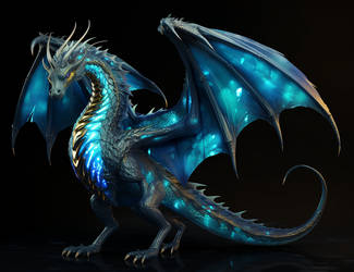
First of all, I must say it's a really great drawing. I especially enjoy the anatomy, which is not far from flawless, even if there are still some minor problems (I'll come back on it later). The choice of colors is great and effective, and you manage to alter them so that they help adding relief, depth, and realism to the picture. This is in my opinion the greatest strength of this work.
Now, as a critique, I have to prove that this widget can be of some use, and point out some points of improvement, right? So here we go.
First of all, the anatomy. These problems (while minor) are pretty obvious and easy to spot, so I will keep it short. First: The "thing" looking like a finger that comes from the elbow has no reason to exist. It doesn't fulfil any physical nor physiological role in the wing. Bats (which are most often used as references for this type of wings) do NOT have that kind of digit. Second: the left wing's forefinger is shorter than the right wing's (Second bis: they might not be perfectly symmetrical, it could be useful to check the perspective). Third: there's a problem with perspective in the tail; whereas the perspective is flawless in the rest of the picture, it looks really odd here, as if the more you go down the tail, the more you move to the right and upwards. And fourth: the head is quite unsettling. Maybe it would be better to push them a bit more in the skull (so to speak).
All these points are minor, as I said. The overall anatomy is stunning and realistic. I especially like the limbs. The muscles are visible, well-placed, and harmonious, the proportions are enjoyable to look at, and the skin texture is great. On the technical aspect, you are very skilled in shading and coloring. The way you render the transparent aspect of the membrane is stunning. The only reason why I didn't give you five stars is the problem with the perspective and the anatomy of the wing.
The vision is good. The character itself is interesting aswell, so good grade for you.
I think the originality is another weak spot. The pose in itself is not new or especially exceptionnal. The use of a grey background is neutral, hence it doesn't have a bad effect on the drawing, but it also doesn't improve it. Hence the medium grade.
About the impact now. There is some dynamism, but not a lot. The grey background doesn't have a good effect on this aspect, though another could have been worse. It is well executed though, so you deserve a good grade.
That's it, I hope it will be useful. Keep up the great work! <img src="e.deviantart.net/emoticons/s/s…" width="15" height="15" alt="